Showing posts with label highlight. Show all posts

Sunday, April 12, 2015

ISATA Conference: Painting Seminar

Brick Painting

ISATA
For the past four years, I have been privileged to be invited to present at the Idaho Speech Arts Teachers Association annual conference.  ISATA is an association of speech, debate and drama teachers at the high school level all across the state of Idaho.  I have enjoyed my association with ISATA and have loved getting to know many of the drama teachers across the state.  A few of them are my former students.  The cool thing about students is that some of them eventually become colleagues.  That is how I view my former students who are teaching high school drama.  It's great to see how they are taking what they learned at school and are incorporating it into their classrooms.

The first three years we met at the Sun Valley Resort at Ketchum, Idaho.  Last year we met on the campus of Boise State University.

The first year my presentation was titled, "Props on a Shoestring" and focused on props that could be re-purposed from thrift store finds.  The second year I presented  "Magical Tomes", crafting interesting book covers from thrift store books.  The third year I presented two different ways to paint woodgrain.

Last fall, I presented for the fourth time and I called the presentation "Thick as a Brick".  I taught four different methods of painting bricks.

Method #1  Sponge Brick
A few days before heading to Boise, I prepared a few sample boards with base coats.  I knew because I had limited time I would have to present this like a cooking show with pieces in stages so I wouldn't have to wait for paint to dry.

I painted a few of them with a grey on grey scumble, and a few of them with an earthy red scumble.  The grey scumble would be for brick painted with the mortar first and the reddish would be for brick painted with the brick color first.

On the mortar first sample, (I unfortunately do not have a photo of this step) I painted several different patches of red brick colors on a staging board then I pressed a butterfly mop sponge into it.  Just the head of the mop, not the whole thing.  Then, I pressed the sponge onto the grey painted board and repeated the process until I had the piece covered.  I paid careful attention to make sure the brick coursework was reasonably even but not too perfect.  At that point I had to set the sample aside to wait for the paint to dry.  While it was drying I did a different paint demo.

For the purpose of this blog post, however I'll go right on.

Brick shapes painted with butterfly mop sponge head

Once the paint was dry and I had a chance to come back to it, I took a wash of a darker brick color and painted it over random bricks on the sample board.  That's just for variation.  Then I had to wait for that to dry.  Next time I'll do more in the way of the cooking show samples.

Finally, I added shadow lines and cut lines.

Picking out a few bricks with a wash of color

Method #2:  Older, Decayed Brick
While in graduate school, I developed a custom tool, based on a tool my adviser had made.  He had cut a roller so you could paint perspective brick courses with it.  I adapted that tool to be a roller that only painted the mortar.  His tool painted bricks while mine painted mortar.  I found a roller sleeve that was slightly encrusted with paint, to the point that they were going to throw it away.  I marked where four mortar joints would be, with a sharpie, then I took it to the bandsaw and shaved off all of the nap from the roller that didn't fit within my mortar lines.  I showed the class members the custom roller, then I showed it to them in action.

The custom mortar roller

I started with a board I had previously painted with a reddish brick colored scumble.  Then I took a mortar color and painted some of it on a staging board and charged up the roller.  When you use this tool, it's imperative that you keep the tool moving in a straight line.  Otherwise you get wonky mortar lines that don't look particularly real.  Finally, when you have painted your first set of lines, the best way to keep them lined up is to overpaint the last mortar line with the first mortar line from the next pass.  So you end up painting three mortar lines at a time rather than four.

Showing the overlap

Showing the uneven quality of the mortar roller

The mortar roller is useful when painting older, decayed brick because it tends to be intermittent and the lines, while straight overall, have a jagged edge.  When all the horizontal mortar lines had been painted, I took a small chip brush and tapped in the vertical mortar lines.  Tapping or stippling helps get a similar quality in the vertical lines that you achieve with the mortar roller for the horizontal lines.

Tapping or stippling in the vertical mortar lines

What that looks like

As with the other sample, I had to put that aside while I waited for paint to dry, and did another demo.  The final piece of this one was to add shadows and cut lines.  I use Paynes Grey, thinned to a transparent wash for my shadow colors.  For the cut line I use flat black.  If I have Rosco Velour Black, all the better.  The shadow goes opposite the light source, so it's important to remember which direction the light is coming from.  I shadow one side and the bottom of each brick.  The shadow gets cast into the painted mortar, not on the brick.  Highlights (if you use them) go on the brick, not the mortar.  The cut line is a very thin line in flat black right where the brick meets the mortar.  I paint that with a one inch Purdy.

Painting shadows

I worked with a painter one time that hadn't really every painted shadows.  We were doing a stone wall for a castle and he did a really excellent paint job of individual stones.  He didn't think we needed shadows, but I painted a small section of shadows and had him look at it from the audience.  The shadows make the bricks pop out, visually.  Makes them look 3-D.  He understood, then we painted in the rest of the shadows.  The detail work is only about five percent of the job, most times.

Method #3:  Newer Brick
For this brick, once again I started with a three color brick red scumble.  This time, instead of painting the mortar lines with a roller, I measured them and marked them with charcoal then I painted the mortar lines with a straightedge and a small scenic fitch brush.  When that was done, I used the same brush and painted in the vertical mortar lines.

Starts with a three color scumble and a little spatter

Mortar lines with a lining stick

Cleaner mortar lines

When using the lining straightedge with a fitch, the quality of line is cleaner which gives the appearance of newer brick, brick that was laid with care.  When the horizontals are done (and dry) you use the lining stick for the vertical mortar and alternate from row to row so you get the overlap to look like true brick.

Once again, shadows and cut lines.

Brick with shadow lines and cut lines


Method #4:  Tape and Texture
The last method I showed was three dimensional brick made with stucco.  I created one of these  prior to my presentation because this one takes about 24 hours to dry.  I needed one to paint for the demonstration.

First of all, I go to the local paint stores and ask for a product called Total Wall which is an acrylic based stucco.  I ask for the mistints because they can sell them very cheap.  Mistints are when the paint store employees make a mistake and add the wrong color.  The mistints sit around in the shop taking up space and generating no income.  Then I come along and take them off their hands.  When you have a limited budget, this is a great way to get some special paint effects for not much money.

The first step in this process is to lay out the mortar lines with a straightedge and a pencil.  Then you take half inch wide masking tape and lay down over all the mortar lines.  It's important to determine which side of the line you are going to put the tape down on so you get the same size bricks every time.  The horizontal tape lines go on first then the vertical lines go on.  It's important for the horizontal tape lines to project past where you are going to place the stucco so you have tabs to pull.  It's also important to overlap the vertical tape lines onto the horizontal lines.  When you pull the horizontal tapes, they will raise the ends of the vertical tapes.

Once the tape has been laid down, you apply a generous layer of stucco.  I like to lay it down at least a quarter of an inch thick.  Then you can take a brush and create textures in the stucco.  Sometimes I put lines in it, sometimes I stipple all over.  Just depends on what look I'm trying to achieve.

Putting texture on taped surface, using a large putty knife initially

Stippling into the texture

Once you have the texture how you want it, it's time to pull the tape.  The tape can and should be pulled as soon as you have the texture the way you want it.  Do not allow the stucco to dry or set before you pull the tape.  It's disastrous if you do.  Pull the horizontal tapes first and they will lift the ends of the vertical tapes.  It's really quite easy and you get a lot of bang for the buck.

Pulling the tape

Then, when the piece is dry, 24 hours later, it's just a simple paint job.  Scumble on the brick color and then fill in the mortar color with a smaller brush.  The brick scumble and the mortar color can be painted wet on wet if your paint isn't too wet.  I like to add modulations in individual brick to make it look more realistic and less like a paint job.  Let the paint dry and you have 3-D brick.

Painting mortar wet on wet

There it is.  Notice the darker colorization on a few bricks.  Makes it more legit, I think.

It has been a fun association for me to present each year at ISATA.  I enjoy hanging out with the high school drama teachers.  I enjoy being able to share some of the things I have learned with them.  Then they can take those skills back and teach their students.  I hope to continue this relationship for many years to come.

Saturday, April 4, 2015

Cobalt Studios: Summer Scene Painting #9

Cobalt Studios

Foliage Project
The foliage project was a quick project we painted in between other projects.  It was also the last project we painted that the instructors demonstrated on..  The foliage project came toward the end of the second week of Cobalt Studios Summer Scene Painting.  After the foliage project, the format changed and we were accountable for everything we had been taught to that point.  I liked that approach.  Class demonstrations until all of the skills had been taught and then a whole week of painting where we had to determine for ourselves with a little guidance from the teachers what paint techniques we would use.  But more of that later.

Rachel had pre-mixed all of the paint we would need on the foliage project.  The first thing we did was to look at photographs from magazines of trees and foliage.  We talked about what we noticed in the pictures, things like the aerial perspective and such.  Then we went over to the paint deck and Rachel demonstrated the techniques for painting foliage.  Each of us painted from the same photo as Rachel.  This was the last time we would all be painting the same thing.

Step #1:  The Sky
The first thing we did was cartoon out our horizon line with charcoal on a bamboo.  Then we were ready to paint the sky  The sample we were given to paint from had a very pale sky, almost white with just a little hint of blue in it.  We put our paint in a garden sprayer and laid in our sky color very quickly.

Horizon line and very pale sky color laid in with garden sprayer

Step #2:  The Horizon Line Part #1
We had several greens and blues pre-mixed by Rachel.  These are colors that she derived from our photo reference.  We painted the bush in the background first by brushing and dabbing.  We dabbed our paint to create a leafy texture.  It's also important to find a brush that has splayed bristles or a brush that you can get the bristles to splay.  That helps with the texture.

Once that part is dry, we had to paint the aerial perspective.  Aerial perspective is when items in the background appear lighter and hazier than things in the foreground.  I had always thought you had to mix separate paints for aerial perspective.  Seemed like a lot of extra work.

Rachel introduced us to a new tool called a PreVal Sprayer.  Basically, a PreVal is an air canister with a jar beneath where you can make your own custom color of spray paint.  It works with oil, alcohol or water based paints and dyes.  Pretty incredible.

We took the sky color and put it in a PreVal and sprayed over the background bushes.  Now that I know about that, it seems intuitive.  But it was mind blowing at the time.  Suddenly, by adding the sky color over the top, it blended the background bushes with the sky, or at least brought them a little closer together.  The real thing it did, though was to make the bushes in the background live in the same world as the bushes in the mid-ground because we used the same colors.  The sky color made the background bushes hazier and lighter.

The background bushes dabbed on with three colors or so

The PreVal Sprayer with sky color

The background bush with sky color on it

Step #3:  The Horizon Line Part #2
Next, we painted the mid-ground with the same colors we used for the background.  This time, though we used an additional darker brown to get into the shadowy part of the bushes.  This was painted by brushing and dabbing as well.  When we painted the background, we deliberately painted over the lines between the background and the mid-ground so we'd overlap them.  We also spent more time on the mid-ground shaping and giving drama and character to the bushes.  We paid attention to highlight and shadow in this step.

The mid-ground painted with stroking and dabbing

Step #4:  The Tree Limbs
We painted this project very rapidly and I did not get any photos of this step.  However, in the final photo you can see what we did.

We took large Purdy brushes (two or three inch angled sash brushes) and a darkened burnt umber and while looking at the original source material upside down, we painted the tree limbs upside down.  On drapery and foliage, Rachel said she liked to paint upside down because she could focus on the abstract nature of things rather than try to intellectualize about shade and shadow.  That made sense to me because I like intuitive stuff better than intellectual stuff for the most part.

We laid in the tree limbs and then paid attention to the minor branches.  Then it was time to finish the piece.

Step #5:  The Leaves
For the leaves, we used cut rollers.  These were foam rollers with leaf shapes cut into them.  Or in other words, we drew the leaves with a sharpie pen on a foam roller and cut away everything else.  We poured our darkest color out onto a food service tray and then charged the roller.  The darkest color we rolled everywhere there were to be leaves.  It's important when using a roller like this to not just roll.  It's more of a flick and dab approach so you lay down individual leaves rather than creating a pattern.  It's appropriate to just use a corner of the roller here and there to create single leaves.

While that color was still wet, we poured a lighter color for the mid-value leaves onto the food service tray.  We didn't clean the tray in between these steps.  We used the leftover dark as a color that would mix in the roller.  In that way, we got two or three shades of paint while only using two colors.  This step covered only about sixty to seventy percent of the leafy area.

While that process was still wet, we added our highlight color to the tray and without cleaning the tray or roller we painted in the lightest color of leaves.  The highlight color only covered between five and ten percent of the total piece, and we were careful to add it where the lightsource would actually highlight the branches or leaves in our sample.

The finished piece.  Note the food service tray with all colors on it.

This was a very quick and messy technique.  Messy and sloppy, and yet the results are excellent.The use of the PreVal and the sky color to achieve aerial perspective was revelatory for me.  I also liked the use of the cut roller to achieve the foliage in a very quick way.

When I have painted foliage before, it was tedious and I had a difficult time allowing the negative space between leaves and branches.  I tended to fill everything in.  Painting most of the foliage upside down also helped.  It allowed for more abstract thought rather than trying to think my way through every branch and every leaf.

While she was demonstrating, Rachel took a brush full of paint and painted some green paint on the bogus paper.  Then she stepped on it and took a step on her work, which left a footprint in the middle of the sky where the branches were to go.

She winked and said if she couldn't fix something like that she didn't deserve to be a scenic artist.  Priceless.

Thursday, April 2, 2015

Cobalt Studios: Summer Scene Painting #8

Cobalt Studios

Drapery Project
At Cobalt, as I have said a few times before, there was no wasted time.  Each time we finished a project, we'd set up a new project.  We would stretch muslin over our flats and have to size them with starch.  While we were waiting for the starch to dry, Rachel or Kimb would teach us something else.  On one of those occasions we learned about painting drapery.

Of all the things I painted at Cobalt, I think my drapery assignment was my least successful.  If I had to choose one project that I liked the least (not because of the teachings or anything the teachers did) I would choose the drapery project.  I performed the least well on that one.  I had one unteachable moment at the beginning of the project and it served to sabotage me all the way through.  I try to be teachable all the time.  Once in awhile I mess up, though and the drapery project was one of those times.  Consequently I had to learn the hard way on this project.

But since I learned things on this project and I am not afraid to admit when I've made a mistake I have decided to blog about it anyway.

Step One:  Base Coat and Cartooning
This was one of those quick projects in between other projects, and we were told to take a flat that was 2' x 3' and choose two colors from the paint corral and scumble them together.  I chose purple and yellow.  The paint corral was a collection of all the extra paint we had mixed up until that time.  When we would finish a project, instead of throwing away all that paint, we capped it and put it in the paint corral.  Then it was fair game for anyone to use from that time on.  It saved a great deal of time in paint mixing.  No sense mixing a new color when the color we wanted was already mixed.

I chose purple and yellow, complementary colors.  Other people were choosing blue and light blue, or blue and green, colors that were analogous or related to each other in some way.  Kimb questioned me about my color choice and I think was giving me the opportunity to make a switch, but I went ahead and did it anyway.  This was my one unteachable moment while at Cobalt Studios.

At this point, we didn't know what we were painting, we had just been told to scumble two colors together.  Then we found out.  We were painting drapery, but not just any drapery, embroidered drapery.  Even though I made a poor decision at the beginning of this project, I still learned the principles and when I have to paint drapery like this again, I will have a much better outcome.

Rachel showed us a photo of drapery that she had put through photoshop and had abstracted it into color blocks that represented local color, shade, shadow and highlight.  With charcoal on a bamboo, she then cartooned out the big shapes on her demo piece.  She suggested that with drapery, she usually cartooned it upside down because she was more successful on drapery when she approached it in the abstract shapes upside down than she did when she painted it right side up. I followed suit.

Ugly scumble of purple and yellow and charcoal cartooning

Step #2:  Stenciling
Next we were shown the collection of stencils and asked to find a stencil with an all over pattern but one with recognizable shapes within that pattern.  Rachel then taught us how to stencil specific to this project.  With wallpaper, it's important to meet edges and to be careful where the repeats go.  On embroidered drapery, however, it's important for the stencil to follow the curves.  We worked on one fold at a time with the stencil, making sure the recognizable shape was visible here and there.

I was not having a good color day and I chose brown for my stencil color.  Another poor choice.  That's the thing about choices.  A poor choice is still a choice.

Ugly brown stencil on an ugly purple and yellow scumble

Step #3:  Shade
Rachel then demonstrated how to paint the shade.  Once again, shade is the shadow on a surface caused by the absence of light on that surface while cast shadow is the shadow that is projected off of one surface and onto another.  The shade on this project as on all the other projects was made of burnt umber and ultramarine blue, thinned to transparency with water.

It's important to note that scenic artists keep the paint elevation or other reference material close by when they paint in order to compare and refer to it during the process.

The shade is painted by finding the deepest part of a fold and painting darkest there and bringing it out into a fuzzy line as the shade transitions to the light.  Fuzzy lines are made by painting a brush stroke of clear water on the fuzzy edge before painting with the paint color.  The paint then mixes with the water which dilutes and thins it.  We help a fuzzy line out with a brush just a little.


Rachel painting the shade upside down.  Note the source material next to her work

My project with the shade painted on it

Step #4:  Cast Shadow
Looking at the source material, we were to identify the difference between the shade and the cast shadow.  Whereas shade has a fuzzy edge, cast shadow has a hard edge.  Our cast shadow on this project (on every project) was a mixture of ultramarine blue and velour black, thinned to transparency with water.  In other words, Payne's Grey.

The shadow painting was pretty straightforward.  Where the shadow was on the reference, transfer it to the painting.  Pretty quick.

Shadow added

Step #5:  Hightlight
In the high points of the drapery, where the light would strike it normally, we added highlights.  Highlights are made by taking the predominant local color, and adding the "color of the light".  I had always made my highlights by adding white paint to the local color prior to studying at Cobalt.  Adding the color of light for my highlight was revelatory for me.

Since my predominant color on my piece was an unattractive yellow, I added the amber color of light to my base coat.  Still another example of where my poor choice at the beginning served to make this project less successful than it should have been.

As I looked at everyone else's work on this project, I have to say on this one mine was the weakest, and that was due to my one unteachable moment at the beginning of the project.

Highlight added

I really want to paint this project again, but this time make a better choice at the beginning of it.  I wish I had taken the opportunity Kimb had given me at the beginning to choose better colors.  I'm glad I didn't end my Cobalt experience on this project.

Cobalt Studios: Summer Scene Painting #7

Cobalt Studios

Grey Marble Trompe L'oeil 
For my mid-value marble, I chose a grey marble with black and white veins.  I had painted grey marble many times, but I wanted to experiment with a different techniques.  I asked Kimb if she had ever used charcoal for the veins in marble.  She knew a technique for that and coached me through it.

This project was really in two parts.  The first part was to paint a slab of marble and the second part was to paint a carved, trompe l'oeil entablature, complete with egg and dart moulding and dentals.

Step #1:  Base Coat
The piece of muslin I was using had already been primed with starch so I didn't need to do that.  I began with a three color scumble to block out the color zones in the marble.  A neutral grey, a darker grey and a lighter grey, mostly cool but the lighter value was a little warmer.  My scumble wasn't overly blended.  I wanted hard edges in places that would inform me later on where the veins should go.

I also spattered a little of the lighter value in places.

Base scumble

Step #2:  Veining
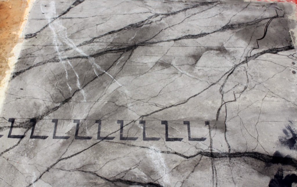
After talking with Kimb about process, I placed a large piece of vine charcoal in a bamboo and drew out the major veins.  Then I used a smaller piece of charcoal in a smaller bamboo and drew in the spidery veins.

Then I used Sculptural Arts Coating, Flat Plastic Varnish to seal in the charcoal.  I mixed the plastic varnish with one part varnish to seven parts water.  Then I applied it with a sea sponge, in a dabbing technique.  The dabbing with the sea sponge doesn't just seal the charcoal, it also moves the charcoal powder around and it tends to blend the overall piece.

The plastic varnish, mixed with the charcoal dust in the sea sponge tended to give the marble a granular feel, like real marble has.

Charcoal applied very heavily

Sealed and blended with plastic varnish

The piece I chose also had some white veins in it as well.  I thought about setting them with white paint, but then I remembered I was trying to learn something and do something I had never done before.  I found some chalk and laid in the white veins and once again used the plastic varnish to seal in the chalk.

White veins added in chalk, before the plastic varnish

Once the marble slab was complete, it was time to paint the trompe l'oeil.

Step #3:  Shadow and Shade, The Stencil
Once again, we used a story stick to lay out the horizontal lines of our entablature.  We were also instructed to walk around our piece and find our least favorite corner and orient our painting accordingly so we could paint it out like the other marble piece we painted.

Once we had our marks made and our horizontal lines cartooned in, we then painted in our cast shadows.  Most of the time, we paint our shade first, but on this type of trompe l'oeil, we paint that second.  The cast shadows inform the painter where the shade, highlight and zingers go.

To paint the cast shadow, we used stencils.  These were shop made stencils, made in the style of the Metropolitan Opera.  Rachel and Kimb learned how to make these stencils from the scenics there many years ago.  These stencils are made by first drawing out your design on a piece of kraft paper.  Then, using clear packing tape, completely cover the back side of the kraft paper.  Then you turn the paper over and completely cover the front.  Always careful not to create any puckers.  Then, using an exacto knife, you cut out the pattern.  Voila, instant stencil.  You don't have to find it online, buy it and wait for shipping.  You can create a stencil in this fashion and go straight to work.

We painted the cast shadows for the dentals and the egg and dart first.  This was the only part of the project I painted sitting down.  For everything else I used a bamboo brush extender and stood up to paint.

Metropolitan Opera style stencil.  Notice that the horizontal lines and the profile of the entablature have been drawn on with charcoal

Stenciling.  The only thing I did down on this project.  Everything else was done standing up with bamboos

Dentals shadows stenciled in

Egg and dart stenciled in

After the stenciling was done, I then added the shade.  Shadow is basically Payne's Grey and shade is made with ultramarine blue and burnt umber.  Shade is slightly warmer than shadow.  Shade is the darker area on a surface, caused by lack of direct light, whereas cast shadow falls away from an object.  The dentals don't get shade.  The egg and dart do.  The shade on the egg got a fuzzy line in the center, as did the curved portions of the entablature.

As in all trompe l'oeil applications, the most important thing to remember is light source.  Where is it coming from, what angle, what direction.  Always remember where your light is coming from.

It was also at this time that I painted the shade and the cast shadow on and under the horizontal lines of the rest of the entablature.

Shade and shadow

Close up.  Note that the shade is slightly warmer than the shadow.

Step #4:  Highlight and Zinger
Shade and shadow work best when they are painted transparently.  Highlight works best for me when it's painted translucently.  Zingers are opaque.

The highlight is made by taking the local color and adding the color of the light.  In this case I chose a pink for my primary light color.  The highlight goes on, basically opposite the shade.  The center of the egg also gets a fuzzy line with the highlight.

Highlights added.  I didn't really like the highlights on the dentals, but I believe from stage they'd read okay.

Next, we painted the zinger on the highest part of the relief.  I used a one inch Purdy for that.  The zinger is the highlight color with white added.  White tends to make everything a little more opaque.  It's good for a zinger to be opaque.

Zinger added, including a dab on the egg

Step #5:  Bounce Light and Cut Line
For my bounce light, I chose and orange.  Thought it would be dramatic.  I also considered it to be straight on and at ankle height, as if it were from a fireplace.  Bounce light tends to accent a piece in a dramatic way.  Wherever we go, there is rarely a single light source.  Bounce light creates just that much more credibility in trompe l'oeil painting.

Bounce light added.  Close up, it looks a little broad, but from stage it blends quite nicely

Then it was time to paint the cut line.  The cut line is opaque black and goes in the deepest part of the shadow, and also where planes are perpendicular to one another within the shadow.

Cut line added

Step #6:  Paint it Black
With a one inch Purdy, I then cut in the profile of the entablature with velour black paint.  Velour black is the deepest, most black artist paint I've ever used.

Once the profile was painted, I got a bigger brush and filled in.  The marble piece was done.

Cutting in with the one inch Purdy

All blacked out

The finished piece on display

Along with it's brother

This was a very rewarding piece to paint.  I had painted trompe l'oeil a little bit before, but never to this level of detail.  It opened up new horizons for me as a scenic artist.  I can't wait to paint more of it.  My time was well spent at Cobalt Studios and I am thankful to the Administration of BYU-Idaho and the College of Visual and Performing Arts for giving me the opportunity to go out and better my craft and for investing the resources for me to do so.  I believe it was money well spent.  My scene painting class was good before the Cobalt experience but it was exponentially better after.  I can't wait to teach it again.