Thursday, April 16, 2015

Spinning Into Butter--Scene Design

Scene from Spinning Into Butter

Spinning Into Butter by Rebecca Gilman was produced Fall Semester, 2004 in the Kirkham Arena Theatre at Brigham Young University-Idaho.

Synopsis
Sarah Daniels is the dean of students at a mostly white, fictitious private university in Vermont.  One of the African American students has been targeted for hate crimes.  He has received threatening letters addressed to "Little Black Sambo."  It is Sarah's responsibility to get to the bottom of it and punish the perpetrators.

In the meantime, one of the white student body officers comes to her to propose a seminar against racism for the student body.  They hold the seminar and the black students find it patronizing and demeaning since none of them are really invited to participate and it ends up being a bunch of privileged white kids saying we shouldn't be racist etc...

Sarah works hard to do her job to ease racial tensions, but in the meantime we learn that when she was hired to be the dean of students, the university had been under fire for having an all white faculty and administration.  Sarah had been working at an all black university in Chicago and the administration hired her without an interview, thinking she was black.  They were all surprised when she showed up as white.  This caused some consternation among the other administrators.  They felt lied to even though she hadn't lied.  They assumed she was black.

In a moment of honesty and clarity, Sarah confides to her one friend on the faculty that she left Chicago to come to Vermont to get away from black people.  She loathed herself because she was a closeted racist.  She tells him when she rode the bus she'd first look for a white person to sit by.  If one wasn't available she'd look for a yellow one.  She'd stand rather than sit next to a black person.  She wrote some of this down on a notebook and then they left to get dinner.  While they are away, one of the administrators who disliked her entered her office and snooped through her stuff and found the incriminating evidence.  Confronted with this evidence Sarah decided to resign.

In the meantime it is discovered that the black kid who received the threatening notes had written them himself.  He claimed to have been out of his body while he saw himself writing the notes and tying them to the brick and hurling it through his window.  Because of this, he is expelled.

While she is packing up her office, Sarah tells her friend the story of Little Black Sambo.  The story goes that Little Black Sambo was walking through the forest in his finest clothes.  A tiger saw him and threatened to eat him.  Little Black Sambo gave the tiger his fine new coat in exchange for a promise not to eat him.  The tiger went on his way thinking he was the most fabulous tiger in the forest.  Little Black Sambo encountered another tiger with a similar result.  This happens over and over until Little Black Sambo is left only in his underwear.  Meanwhile, the tigers all encounter each other and each thinks he's the most fabulous tiger in the forest.  They are all jealous of each other and start clawing at one another.  As the fight, they start spinning around in a circle and the spin faster and faster until they spin themselves into butter.  At that point, Little Black Sambo collects his clothes and puts them back on and scoops up a bunch of butter and takes it home.  His mother makes pancakes for the family and they spread the tiger butter that Little Black Sambo has collected.

Sarah and her friend realize that the black student who wrote the note was manipulating the administration, causing them to spin themselves into a frenzy.  As she leaves, she makes contact with the black student and tells him not to be so hard on himself.  As a result of her being there, things actually got better, and because of her confession, she felt cleansed.  We get the sense that even though she is going away, Sarah Daniels will be okay and will be less racist.

The play takes place entirely in her office.

A Note About Little Black Sambo
When I was a boy in the 1960's, there was a restaurant chain called "Sambo's."  It was a pancake house.  Every time I went to Utah with my family and spent the night, we'd get up the next morning and eat at Sambo's.  I remember they had good pancakes.  There was a wallpaper frieze in the restaurant that told the story of Little Black Sambo and the tigers, and you could purchase the children's book from them.  It was a different time, I was just a little boy and had no conception of what all of that meant.  It was just a story to me.  I liked to go there because of the good food.  All but one of the Sambo's restaurants have either been sold to other chains, had the name changed, or closed for good.

Concept
As I read this script, on about page thirty I had a very clear image of what this set should look like.  I continued to read and the further into it, particularly when Sarah reveals her inner racist I knew that my inclination was correct.  I read it again and could see the play done in no other way.

I phoned the director, Hyrum Conrad and asked to come to his house and talk about the play.  It was a Saturday.  That's how excited I was by this concept.  It was very early in the process.  We had just barely received our perusal copy of the script and Hyrum had not yet created a production concept.  I told Hyrum how I felt about the show and how I felt it should be done.

I thought we should actually build her office on the Kirkham Arena Theatre stage.  All four walls with two doors.  A front door and a back door.  I though there should be a wainscot and a crown moulding around the top.  Where the walls should be, between the wainscot and the crown moulding would be gone.

Hyrum didn't bite immediately, instead he asked me to justify and intellectualize my feelings.  Up until that time, my thoughts on this show and this design were just feelings.  Hyrum often wants to hear from a designer's creative side and intellectual side.  If those two aspects of the personality can come to agreement, it's often right.

From an intellectual point of view, I decided we needed a barrier between us and Sarah.  I wanted each audience member to have an individual response to this play, even though they may be sitting next to their spouse or best friend or a boy or girl they were trying to impress.  I coined the term in that meeting, "Audience as Voyeur."

I wanted every audience member, as Sarah talked about not wanting to ride the bus next to a black person, to ask themselves, "Have I ever done that?" or "Would I ever do that?"  I wanted the audience members to confront whatever demons they had inside of them on this issue.  I felt that placing the barrier between them and the actors would help them do just that.

I also wanted the audience to look across the set and see the other audience members, like a mirror.  Sarah says some very regrettable things about herself.  I thought the audience needed to feel like they were looking through a keyhole or listening in on a conversation they shouldn't be and feeling a little guilty about it but not turning away.

Hyrum agreed and we went ahead with the concept.  This is one of only a handful of times in my career where I came to a production concept ahead of the director.  Typically the director comes up with it and the designers design within it.  Hyrum had just started working with this script and hadn't come up with the production concept.  That was the first and only time while working with Hyrum that I came up with a concept before he did.

Execution
I built a white model for this play.  Sadly, none of the pieces of that model exist anymore.  When I took it to the meeting, I brought along a pair of scissors, an exacto knife and some masking tape.  It was a very nice white model.  Hyrum and I and the other designers had been working with this material for awhile and we had agreed on things in principle, but this was the first time anyone had seen it in three dimensions.

I could tell that Hyrum was hem-hawing about something on the set, but because it was a pretty model, he seemed reluctant to say anything negative about it.  This was in a production meeting with all of the faculty, not just the ones working on the show.  Finally I asked him, "If there was one thing on here that you would change, what would it be?"  With that invitation, Hyrum mentioned something at the top of the set that he thought shouldn't be there.

With that, I reached into my back pocket, grabbed the scissors and hacked it off.  One of the other faculty members threw himself across the table trying to stop me from hacking it up.  He was too late.  It was pretty funny.  He appeared to me to be in slow motion, shouting (also in slow motion) "NOOOOOOOOOOOOO!"

Once the model had been desecrated, we were then able to go to work.  I got out the tape and the scissors and the knife and made it available to Hyrum and the two of us hacked and taped and worked over the model together.  I love working in this way.

When we had the design the way we wanted it, I then drafted it and made a painted model of it.  Here are some images of the painted model.  This was many years ago and many of the model pieces no longer exist.  All that is left of this one is the skeleton.  Still, it shows the concept we were working with pretty well.

Model for Spinning Into Butter

From another angle

And another

And another

Detail of the door

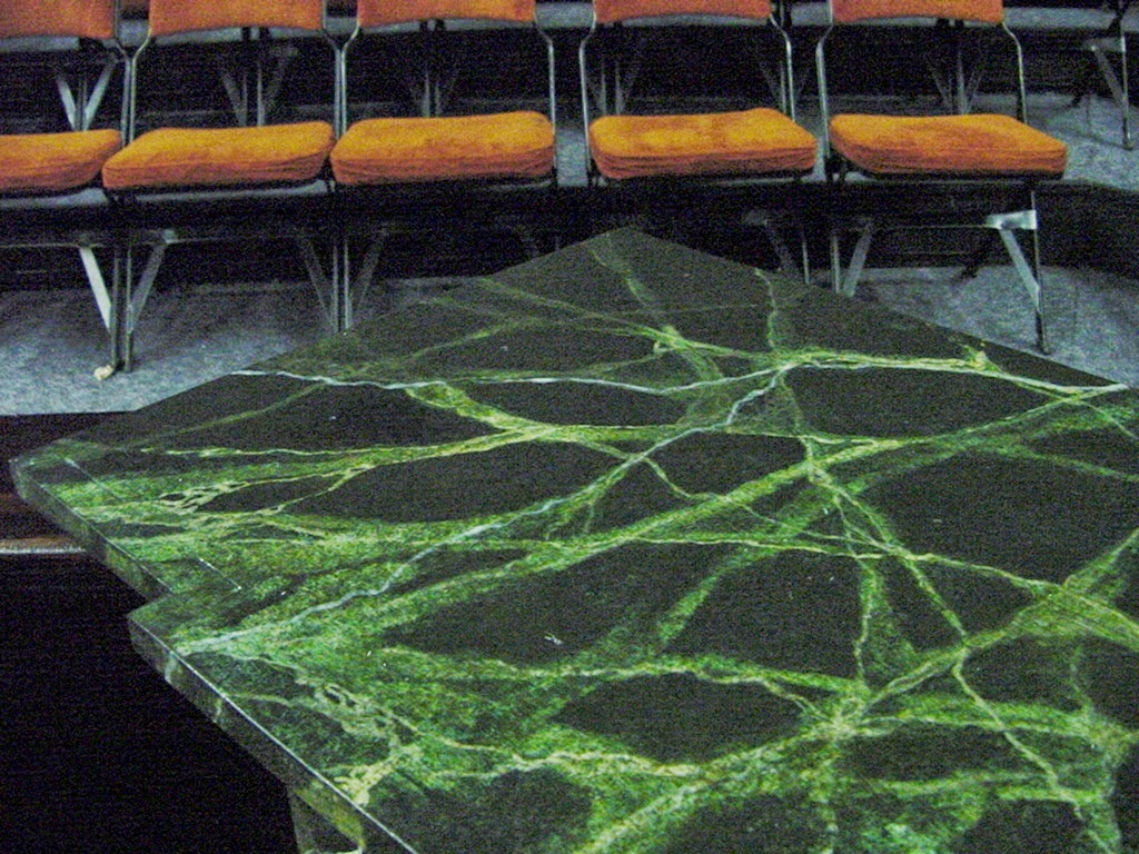
The idea of the barrier was visceral, but we also wanted to treat this in a very realistic way, so I had to justify and rationalize everything in it.  In addition to the basic set design, Hyrum suggested that there be an indication of tiger stripes here and there.  I decided that all of the paneling in the office should be painted to look like crotch figure mahogany.  That particular woodgrain has inherent tiger stripes.  In addition I painted a marble floor with burnt orange veins, also to represent tiger stripes.

As far as the room went, I decided that this was a building that was more than a hundred years old, in the east, and one that was built before central heating, plumbing and electricity.  As a result, I had a two inch water pipe in one corner, and a raised wooden dais in a different corner with a heating vent in the middle of it.  There was also a long unused fireplace in another corner.  These signified that they were placed here after the fact, after the building had been built.  Retro-fitted if you will.  We wanted this to be old.  An old place with old ideas.

The dais with the heat vent in the front of it where the desk sat
The water pipe in the corner

Tiger striped panel in the crotch figure mahogany

The marble floor

The fireplace

I don't remember why I painted it green and black marble but I do remember I wanted it stripey

The door with vinyl letters on bubbled plexi-glas

Sarah was the dean of students but it was well known to her and the administration that she was supposed to be the dean of ethnic students.  They were trying to shed the allegations of racism at their university.  Trying to shed it without actually trying to make inner changes.  There was a certain hypocrisy among the administrators as well as within Sarah.  Because of this, I coined another term called "ethnic chic."  I decided all the set dressing should appear to be from other countries, particularly Africa, Asia and Australia, but if you looked on the back you'd still see the Pier 1 Imports price tag.  I also placed some National Geographic Magazines on the fireplace and found one with Bengal Tigers on the cover.  That one went on top.

Ethnic Chic.  To show that she didn't get it, I added a "Cigar Store Indian" to her office

Ethnic Chic.  Indonesian basket in front of fireplace.  African masks and National Geographic Magazines on top of the fireplace

The set from one direction

From another direction

And another

And another

The cast of Spinning Into Butter

A Concluding Thought
One of our colleagues did not like this set design.  He told Hyrum, "I would never let Gary do THAT to me!"  Hyrum asked him what he meant by that, and he said his students told him that the set made them uncomfortable, like they were Peeping Tom's.  They told him how they felt ashamed when certain lines were said and that they didn't feel a group dynamic with the rest of the audience.  Hyrum said, "Oh, that is exactly what we were going for."  The other colleague seemed disappointed by that.  I felt vindicated.  I always try as a designer to help to tell the story, rather than just creating an environment where the story can be told.  I feel that I succeeded on this one.  I loved this play, I loved our cast, I loved this design.  This was a good experience for me.

Production Details
Directed by Hyrum Conrad
Scene Design by Gary Benson
Lighting Design by Ray Versluys
Costume Design by Susan Whitfield
Technical Director:  Ray Versluys
Costume Shop Director:  Patty Randall

Sunday, April 12, 2015

ISATA Conference: Painting Seminar

Brick Painting

ISATA
For the past four years, I have been privileged to be invited to present at the Idaho Speech Arts Teachers Association annual conference.  ISATA is an association of speech, debate and drama teachers at the high school level all across the state of Idaho.  I have enjoyed my association with ISATA and have loved getting to know many of the drama teachers across the state.  A few of them are my former students.  The cool thing about students is that some of them eventually become colleagues.  That is how I view my former students who are teaching high school drama.  It's great to see how they are taking what they learned at school and are incorporating it into their classrooms.

The first three years we met at the Sun Valley Resort at Ketchum, Idaho.  Last year we met on the campus of Boise State University.

The first year my presentation was titled, "Props on a Shoestring" and focused on props that could be re-purposed from thrift store finds.  The second year I presented  "Magical Tomes", crafting interesting book covers from thrift store books.  The third year I presented two different ways to paint woodgrain.

Last fall, I presented for the fourth time and I called the presentation "Thick as a Brick".  I taught four different methods of painting bricks.

Method #1  Sponge Brick
A few days before heading to Boise, I prepared a few sample boards with base coats.  I knew because I had limited time I would have to present this like a cooking show with pieces in stages so I wouldn't have to wait for paint to dry.

I painted a few of them with a grey on grey scumble, and a few of them with an earthy red scumble.  The grey scumble would be for brick painted with the mortar first and the reddish would be for brick painted with the brick color first.

On the mortar first sample, (I unfortunately do not have a photo of this step) I painted several different patches of red brick colors on a staging board then I pressed a butterfly mop sponge into it.  Just the head of the mop, not the whole thing.  Then, I pressed the sponge onto the grey painted board and repeated the process until I had the piece covered.  I paid careful attention to make sure the brick coursework was reasonably even but not too perfect.  At that point I had to set the sample aside to wait for the paint to dry.  While it was drying I did a different paint demo.

For the purpose of this blog post, however I'll go right on.

Brick shapes painted with butterfly mop sponge head

Once the paint was dry and I had a chance to come back to it, I took a wash of a darker brick color and painted it over random bricks on the sample board.  That's just for variation.  Then I had to wait for that to dry.  Next time I'll do more in the way of the cooking show samples.

Finally, I added shadow lines and cut lines.

Picking out a few bricks with a wash of color

Method #2:  Older, Decayed Brick
While in graduate school, I developed a custom tool, based on a tool my adviser had made.  He had cut a roller so you could paint perspective brick courses with it.  I adapted that tool to be a roller that only painted the mortar.  His tool painted bricks while mine painted mortar.  I found a roller sleeve that was slightly encrusted with paint, to the point that they were going to throw it away.  I marked where four mortar joints would be, with a sharpie, then I took it to the bandsaw and shaved off all of the nap from the roller that didn't fit within my mortar lines.  I showed the class members the custom roller, then I showed it to them in action.

The custom mortar roller

I started with a board I had previously painted with a reddish brick colored scumble.  Then I took a mortar color and painted some of it on a staging board and charged up the roller.  When you use this tool, it's imperative that you keep the tool moving in a straight line.  Otherwise you get wonky mortar lines that don't look particularly real.  Finally, when you have painted your first set of lines, the best way to keep them lined up is to overpaint the last mortar line with the first mortar line from the next pass.  So you end up painting three mortar lines at a time rather than four.

Showing the overlap

Showing the uneven quality of the mortar roller

The mortar roller is useful when painting older, decayed brick because it tends to be intermittent and the lines, while straight overall, have a jagged edge.  When all the horizontal mortar lines had been painted, I took a small chip brush and tapped in the vertical mortar lines.  Tapping or stippling helps get a similar quality in the vertical lines that you achieve with the mortar roller for the horizontal lines.

Tapping or stippling in the vertical mortar lines

What that looks like

As with the other sample, I had to put that aside while I waited for paint to dry, and did another demo.  The final piece of this one was to add shadows and cut lines.  I use Paynes Grey, thinned to a transparent wash for my shadow colors.  For the cut line I use flat black.  If I have Rosco Velour Black, all the better.  The shadow goes opposite the light source, so it's important to remember which direction the light is coming from.  I shadow one side and the bottom of each brick.  The shadow gets cast into the painted mortar, not on the brick.  Highlights (if you use them) go on the brick, not the mortar.  The cut line is a very thin line in flat black right where the brick meets the mortar.  I paint that with a one inch Purdy.

Painting shadows

I worked with a painter one time that hadn't really every painted shadows.  We were doing a stone wall for a castle and he did a really excellent paint job of individual stones.  He didn't think we needed shadows, but I painted a small section of shadows and had him look at it from the audience.  The shadows make the bricks pop out, visually.  Makes them look 3-D.  He understood, then we painted in the rest of the shadows.  The detail work is only about five percent of the job, most times.

Method #3:  Newer Brick
For this brick, once again I started with a three color brick red scumble.  This time, instead of painting the mortar lines with a roller, I measured them and marked them with charcoal then I painted the mortar lines with a straightedge and a small scenic fitch brush.  When that was done, I used the same brush and painted in the vertical mortar lines.

Starts with a three color scumble and a little spatter

Mortar lines with a lining stick

Cleaner mortar lines

When using the lining straightedge with a fitch, the quality of line is cleaner which gives the appearance of newer brick, brick that was laid with care.  When the horizontals are done (and dry) you use the lining stick for the vertical mortar and alternate from row to row so you get the overlap to look like true brick.

Once again, shadows and cut lines.

Brick with shadow lines and cut lines


Method #4:  Tape and Texture
The last method I showed was three dimensional brick made with stucco.  I created one of these  prior to my presentation because this one takes about 24 hours to dry.  I needed one to paint for the demonstration.

First of all, I go to the local paint stores and ask for a product called Total Wall which is an acrylic based stucco.  I ask for the mistints because they can sell them very cheap.  Mistints are when the paint store employees make a mistake and add the wrong color.  The mistints sit around in the shop taking up space and generating no income.  Then I come along and take them off their hands.  When you have a limited budget, this is a great way to get some special paint effects for not much money.

The first step in this process is to lay out the mortar lines with a straightedge and a pencil.  Then you take half inch wide masking tape and lay down over all the mortar lines.  It's important to determine which side of the line you are going to put the tape down on so you get the same size bricks every time.  The horizontal tape lines go on first then the vertical lines go on.  It's important for the horizontal tape lines to project past where you are going to place the stucco so you have tabs to pull.  It's also important to overlap the vertical tape lines onto the horizontal lines.  When you pull the horizontal tapes, they will raise the ends of the vertical tapes.

Once the tape has been laid down, you apply a generous layer of stucco.  I like to lay it down at least a quarter of an inch thick.  Then you can take a brush and create textures in the stucco.  Sometimes I put lines in it, sometimes I stipple all over.  Just depends on what look I'm trying to achieve.

Putting texture on taped surface, using a large putty knife initially

Stippling into the texture

Once you have the texture how you want it, it's time to pull the tape.  The tape can and should be pulled as soon as you have the texture the way you want it.  Do not allow the stucco to dry or set before you pull the tape.  It's disastrous if you do.  Pull the horizontal tapes first and they will lift the ends of the vertical tapes.  It's really quite easy and you get a lot of bang for the buck.

Pulling the tape

Then, when the piece is dry, 24 hours later, it's just a simple paint job.  Scumble on the brick color and then fill in the mortar color with a smaller brush.  The brick scumble and the mortar color can be painted wet on wet if your paint isn't too wet.  I like to add modulations in individual brick to make it look more realistic and less like a paint job.  Let the paint dry and you have 3-D brick.

Painting mortar wet on wet

There it is.  Notice the darker colorization on a few bricks.  Makes it more legit, I think.

It has been a fun association for me to present each year at ISATA.  I enjoy hanging out with the high school drama teachers.  I enjoy being able to share some of the things I have learned with them.  Then they can take those skills back and teach their students.  I hope to continue this relationship for many years to come.

Thursday, April 9, 2015

Cobalt Studios: Summer Scene Painting #12

Cobalt Studios

Final Project:  Translucency

Recap
Three weeks of intensive scene painting instruction were drawing to an end.  I credit Rachel Keebler and Kimb Williamson with creating a program that the value per dollar is unmatched anywhere.  It was relatively inexpensive.  Scenic artists wishing to receive this training would be hard pressed to find a better value anywhere.  First, it's the best training available, and second when you include housing and food into the fees, the tuition looks pretty modest.

Rachel and Kimb never seemed bored with what they were doing.  Always engaged, always energetic, always in the moment, always teaching.  There was no wasted time at Cobalt.  It was fun for me to spend eight hours a day with a paintbrush in my hand again.  It had been a long time since I had been able to do that.

Week one, we were in the studio for about eight hours a day.  Week two we averaged between eight and ten hours a day, depending if we went back to the studio to finish things after dinner.  Week three, I spent about twelve hours a day in the studio, and loved every minute of it.  I wanted to make sure I finished every project and finished them well.  Rachel and Kimb were in the studio for most of this time.  I did some math while I was there and figured that the time spent in the classroom by the teachers in those three weeks would have equaled the time I spent in the classroom in two semesters.

That's intense.  Two semesters worth of work in three weeks.  I came back to BYU-Idaho and immediately taught scene painting.  We met two times a week in three hour blocks.  And we got through almost exactly half of what we did at Cobalt.  I loved my time there.  I would go back again in a heartbeat.

The Final Project
After the tiger on velour project, we began our translucency project.  Cobalt employees had been working behind the scenes sizing muslin for our last project.  They had stretched muslin on half the studio floor and put two coats of starch on it.  As a class, we then put a final coat of starch on that side.  To do a translucency, it takes three coats of medium to heavy starch on one side and two coats of medium to heavy starch on the other side to create the conditions for this project.

While the third coat of starch was drying, we sat in the classroom and listened to Rachel and Kimb teach about the steps and techniques involved with painting a translucent drop.  The idea behind a translucent drop is to paint an image on the front and a different image on the rear so that when the light shifts from frontlight to backlight, the image shifts.To do that, you have to paint the front in more of a watercolor style, in other words no opaque paint.

Since Kimb was my mentor on the previous project, Rachel was my mentor on the translucency.  I was given two images, as was each of the students.  We were all painting different things.  I was given a photo of a pagoda in the sunset with sunbeams bursting through at the horizon.  The other image I was given was of another pagoda, but this one was at dusk or early morning and was hazy.  I was to paint the first image on the front, but use the color scheme and lighting style of the second image.  Then on the back I was to paint the setting sun.  The idea was that when the piece was lit from the front it would look more like the second image but when it was lit from the back it would look like the original image.

Once we were given the images, we were to spend a half an hour or so and develop our best guess at a plan of attack.  We were to write down all of our questions ahead of time and then schedule a visit with our mentor to have our questions answered.  The idea was that we were supposed to replicate the meeting between a scene designer and the charge artist.  These are the images I received.

The first image.  Note the sticky notes.  They were my questions for the designer

The image for the paint scheme on the front.  Not recreating the actual image, just the paint job

I added this picture to show the scale of the image

To restate, I was to paint the figurative stuff (the pagoda) from the first image but with the lighting and coloration of the second image on the front.  Then on the back I was to paint it in such a way that when it was backlit, the image would shift to the lighting of the first image.  I think that is clear.

Step #1:  Sizing and The Test Flat
The shop employees had already sized the muslin twice with starch on one side, and then we as a class did the third application.  We did that at the end of business one day and then came in the next and cut the muslin into the sizes we all needed.  Then we stapled it directly to the floor (which was covered with homasote and bogus paper).  We stapled the unsized side up, then we proceeded to put one more coat of starch on it.  When that was dry we added a second.  In total, to get the translucency, it takes five coats of starch.  Three on the backside and two on the front.

In addition to the regular piece, I also stapled some sized muslin to a small test flat and added the extra coats of starch to it as well.  When working with complex paint jobs, it's important to create a test flat.  It's better to test things and find out if they work or not on something you aren't committed to rather than making a costly mistake on a full size piece.

I approached my test flat in an organized fashion, making notes with a sharpie pen here and there.  I tried several things and found some that worked well and some that didn't necessarily.  I had painted translucently before, but never on two sides.  I knew from previous experience that anytime you add white paint to another paint it begins to turn it opaque.  That is the kiss of death in a translucent drop.  I have learned that if you wish to make something lighter, just like in watercolor, you use the background (in this case the muslin) as a lightener and add water to the paint.  Because I have been a watercolorist in the past, this seemed intuitive to me.

I used Rosco Supersaturated paint on the front.  I think I used straight burnt sienna for the light color and van dyke brown for the dark.  I think those are the colors I used.  Because Supersaturated paint is heavily pigmented, it's possible to thin it with water many times and still have punchy color but create a translucency.  All of those things together seem like they'd cancel each other out, and yet it works.

The last size coat applied

The test flat, front side

When I was satisfied that I had the right combination of paints for the front side of my piece, I turned my attention to the backside of the test flat.  I used Dharma Pigment Dye for the sunbeams.  The pigmented dye is very powerful and you get a lot of bang for your buck.  Once I had the back painted, I took it to the back room where we could go dark and I put a light behind it.  It worked.  I showed it to Rachel and she seemed to get excited by it.  That was encouraging to me.

The backside with pigment dye and opaquing 

Step #2:  The Base Coat
I put the burnt sienna in a garden sprayer and sprayed the entire piece with the lighter color.  When you paint with a garden sprayer, it's important to keep your nozzle in the same orientation for the entire pass.  It's important to start off of the work and spray onto it and also to finish the pass off of the work.  Then you don't get dark spots.  It's also important to paint rapidly.  It took longer to mix the paint and strain it into the garden sprayer than it did to actually paint the piece.  One other thing I learned about garden sprayers is it is important to give them a name.  The reason for that is if you have used the sprayer named "Marvin" and liked the way it painted you can count on it to paint the same way as it did the last time when you use it again.  Lots of cool tricks I learned at Cobalt.

Spraying this

Took less

Than

A minute

Step #3:  The Pounce and TUFBAK
While the base coat was drying, I converted my image to a transparency on the copier and projected it onto a piece of brown kraft paper.  Then I made a pounce.  A pounce is when you perforate a design into kraft paper and then use powdered charcoal to transfer the image to another surface.

I transferred the image to the muslin, then I used the same pounce and transferred the image to a product called TUFBAK, which is four foot wide masking tape essentially.  I never knew it came in four foot widths!  I transferred the image to two pieces of the TUFBAK, one on the front and the other on the backside.  More on that later.

The overhead projector, an indispensable tool of the scenic artist

Image transferred to kraft paper with sharpie pen

Pounced and ready to hit with the charcoal bag

Rubbing the charcoal bag on the pounce

what that looks like

The image transfer

In closeup

Once the image was transferred to the piece, I then transferred the image to the TUFBAK.  I put two pieces of TUFBAK together, front to back, then transferred my image to it.  I had them pinned together so they wouldn't move, then when I cut it I only had to cut once to have a mirror image.  That would come in handy when I painted the backside.

I then placed the TUFBAK to the front of the work to mask it.  Then I was ready to spray the van dyke brown in the areas where the pagoda was.  Anywhere you have a seam with the TUFBAK it's important to cover it with a strip of masking tape.  It's better that way.

TUFBAK applied to the openings in the pagoda

The sheet of  TUFBAK on the cutting table

The TUFBAK applied

Getting ready to paint

The van dyke brown sprayed on

A couple of coats to get the depth I wanted

Step #4:  Aerial Perspective and Details
The second image had an element of aerial perspective to it that the first image did not.  I asked Rachel if she wanted me to replicate that in my piece.  She indicated that she did.  I cut a piece of kraft paper in a horizon shape and laid it down over the pagoda to act as a friskit.  Then I sprayed the van dyke brown again.  That gave me a foreground that was a little darker than the pagoda in the midground.

When that was dry, I came in with a small fitch brush and put in some tree shapes similar to what was on the horizon on the first image.  I also used that to fix a couple of mistakes.

The aerial perspective painted on with a friskit

Details painted on with a small fitch brush

Step #5:  The Backside Opaquing
With the front done, it was time to turn the piece over and begin painting the backside.  The first thing I did, once it was turned was to place the mirror image of the TUFBAK on the piece.  Then I put a thinned version of the opaquing paint in a PreVal sprayer and painted in the areas around where I wanted the sunbeams to be.  I also painted the backside of the pagoda with two or three coats of the opaquing paint in the PreVal.

Spraying the sunbeams with opaquing paint

The opaquing paint was made with equal parts Benjamin Moore white paint and Benjamin Moore black paint.  Rachel likes to use a grey paint for opaquing because it's easy to see where it is.  You could use pure white paint for opaquing, but then you wouldn't be able to see it very well as you painted.

When I was done with the PreVal, I then brush painted the rest of the opaquing on the pagoda and the ground.  I used the PreVal to blend between the brush painted parts and the sprayed parts.  The transition was very important.

Brush painted juxtaposed with spray painted opaquing

Then I used a custom cut roller to create the ripple marks in the water.  We pour paint onto a food service tray and then use that as a charging surface for the cut rollers, much as we did with the foliage project.  When the opaquing was done, it was time to remove the TUFBAK.

Painting the ripple marks with a custom cut roller

All the opaquing done including the ripples

Sometimes this is the scenic artist's best friend

Step #6:  Kitty Litter and Dharma Pigment Dyes
I added kitty litter to the circle where the sun was supposed to peek out between the columns of the pagoda.  Kitty litter is a great friskit.  Then I added the yellow Dharma pigment dye.  I sprayed it from a garden sprayer over the entire backside of my piece.

Kitty litter sun

Yellow Dharma dye on everything

After the Yellow Dharma dye was dry, I added a bit more kitty litter in strategic places and then I was ready to add the orange Dharma dye.  I painted the bottom part of the water, as it looked on the first image, and I also sprayed the orange on the pagoda.  For the orange I used a PreVal sprayer because I felt I had more control with that.  I also brush painted some of the pagoda and the trees on the horizon line, but that was probably because I took the TUFBAK off a little before I should have.  With proper coaching from Rachel, though I fixed that problem.  I got the feeling from both Rachel and Kimb that they wanted each of us to be successful.  I got that the entire time I was at Cobalt.

More kitty litter

Orange Dharma dye

Step #7:  The Last Thing
After we were all done with our pieces, we spent about an hour cleaning the studio while we waited for our pieces to dry.  This was our last project and the studio was going to be closed for a few weeks for vacations and such.  We needed to get it ready for the next group of students.  Once the paintings were dry, we did show and tell.

There were lights hung in the studio that would shine on the front of the work and other lights that were hung to shine on the backside.  There were different colors of gel on some of the lights so we could change the images.  Rachel acted as lighting designer and started out with regular front light on each piece in turn.  Then she'd change the color of the front light to blues or pinks to show what colored light could do to a paint job.  The lighting designer can make or break a great paint job.  It's important to collaborate with them.

After we had exhausted all of our possibilities with front light, Rachel then turned on the backlight so we could see how successful our translucency was.  She also mixed in some front light here and there so we could really see what light does to paint.

I was pretty nervous when my piece was hung up.  Rachel confided to me when I turned the piece over what the degree of difficulty was of this project.  I wasn't confident that I had succeeded at that point.  She turned on the front light, then she added blue light, then she injected the backlight.  Kimb said only one word.  "Stunning."

The front of the painting in regular light

Backlight

With a little blue frontlight on it

I truly enjoyed my time at Cobalt Studios.  I learned so much.  I grew as a painter, and I think I grew as a teacher of scenic painting.  It was a dream come true for me.  I had wanted to study at Cobalt for so long that I felt (as Scrooge would say) as "giddy as a schoolboy."  I didn't take the experience for granted.  I worked hard every day to learn what was being taught.

Thank you Kimb, thank you Rachel.  This was a grand experience for me.